Scandinavian design is famous for its simplicity and functionality. It often features a neutral colour palette with pops of colour used sparingly to create interest. One of the most prominent color codes in the Scandinavian design is forest green and burnt orange, with dusty pink and pastel blue being close contenders. Here are some of the colors that you can expect to find in Nordic furnishings and designs:
When it comes to using these colors in your home. It is important to remember that less is more. Rather than using an abundance of bold colors, stick to a neutral base with carefully picked accents. By using these colors, you can create a warm and inviting living space that looks bright and airy while remaining functional and practical.
The Nordic Color Palette
When it comes to Scandinavian design, the color palette is usually subdued and characterized by a focus on neutrals. Think whites, greys, and blacks. However, there are some key colors that are commonly used in Nordic furnishings and designs that add a touch of vibrancy to the otherwise minimalistic tones.
Understanding Scandinavian Design Aesthetics
Scandinavian design is known for its clean lines, minimalism, and functionality. The aesthetic is inspired by the natural beauty and Nordic landscape. Many believe the subdued colors used by Scandinavian designers reflect the often-overcast and dull weather of the region.
The Role of White and Grey in Scandinavian Design
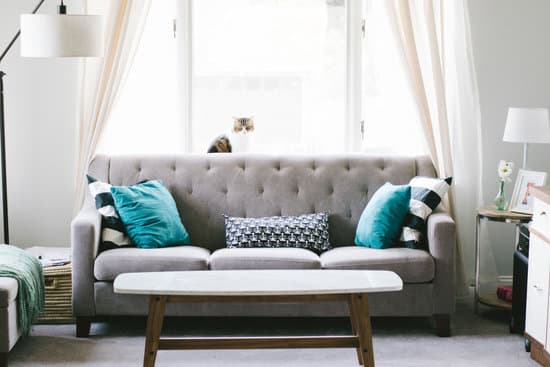
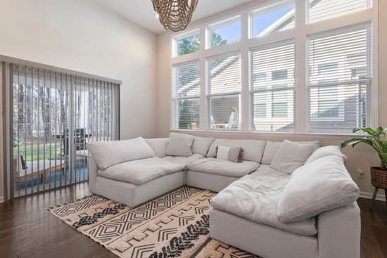
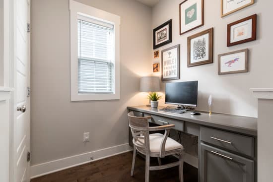
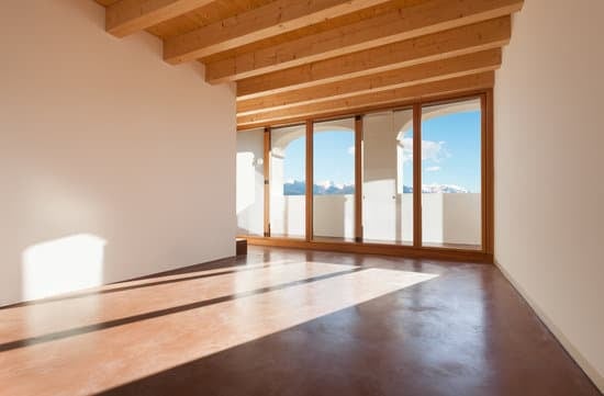
White and grey are the foundation of Scandinavian design, they are often used as the base colors or as backgrounds in the design to create a clean and fresh look. These neutral tones are particularly effective in creating a sense of space, making the rooms feel brighter and more open.
Some specific uses for white and grey in Scandinavian interiors include:
- White walls for a bright and spacious feel
- Grey flooring for a contemporary look
- Grey curtains for privacy without overwhelming a room with heavy colors
Popular Accent Colours in Scandinavian Decor
While white and grey take center stage in Scandinavian decor, accent colors are used to add visual interest and depth to a room. Forest green, burnt orange, dusty pink, and pastel blue are all popular accent colors used by Scandinavian designers.
Exploring the Use of Forest Green in Nordic Furnishings
Green is a calming color and a staple in most natural Nordic environments, so it’s no surprise that forest green is widely used as an accent color. Forest green pairs well with other neutral tones and can add an earthy feeling to a room. Forest green is often used for natural wood furniture and textiles.
Burnt Orange and Dusty Pink: Nordic Color Inspirations
Burnt orange and dusty pink are somewhat unexpected choices for Nordic furnishings, but they work well to add warmth to the otherwise cool and muted color scheme. Burnt orange is perfect for adding a touch of contrast while dusty pink creates a soft and cozy feeling.
Pastel Blue in Scandinavian Interiors: A Delightful Touch
Pastel blue is a classic Nordic color and is often used to represent the sea and sky. In interior design, pastel blue brings a sense of calmness and tranquility to a room. Pastel blue works well on walls, bed linen, and upholstery. It’s a great color choice for adding a soothing touch to any space.
In conclusion, the Scandinavian color code is all about creating clean and calming environments. The colors used in Nordic furnishings and designs are thoughtfully chosen to create a harmonious space that reflects the beauty of the natural environment. Whether its forest green, burnt orange, dusty pink, pastel blue, or white and grey, these colors work together to create a beautiful aesthetic that is both functional and visually pleasing.