Can You Have Too Much Color in Your Home?

Having too much color in a house can be overwhelming and create an unbalanced feeling in a space. While there’s no strict limit to how many colors you can incorporate, it’s important to be selective and intentional with your choices. Here are some signs that you may have too much color in your house:
  • The space feels chaotic or overwhelming
  • The colors clash or compete with each other
  • There’s no clear focal point or sense of cohesion
  • The space feels cramped or small
  • To avoid these issues, try to limit the number of colors you use in a single space. Stick to a cohesive color palette of 2-4 colors and vary the shades and tones for added depth. Introduce pops of color through accessories and accents rather than relying on bold wall colors or patterned fabrics. By creating a balanced and harmonious color scheme, you can achieve a peaceful and inviting atmosphere in even the most colorful of homes.

    The Importance of a Color Scheme

    Painting your home in different colors is a fantastic way to express your personality and style. The beauty of color is that it can evoke emotion, create atmosphere, and set the tone of a space. A well thought out color scheme can make even the smallest of living spaces feel open and comfortable. With that being said, choosing the right color palette is key when it comes to decorating your home. A coordinated color palette is vital to create a cohesive and stylish look. Without a color scheme, your space may come out feeling haphazard and chaotic, not to mention, it can be a major stressor to the eyes.
    Interesting Read  What are the 5 design objectives for a stunning home transformation?

    Finding the Right Balance

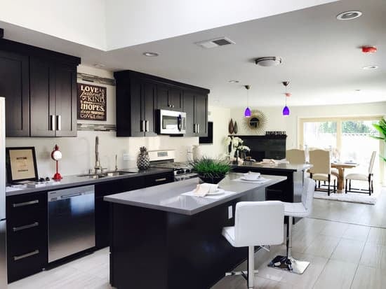
    The real question is, can you have too much color in a house? The answer is yes! It is essential to strike the right balance of color in a space. If you have too much color, your house will appear chaotic and overwhelming, whereas having too little color can leave your space feeling cold and uninviting. The key here is to find the sweet spot between the two extremes. When it comes to getting the right balance, we suggest a combination of neutral and bright colors. It is recommended that you stick to about a maximum of three colors for any given room, with two being the optimal number for a more balanced look. This way, your room will maintain a sense of coherence, making it feel comfortable and welcoming.

    When Too Many Colors Clash

    Mixing too many colors in the same space will most likely result in a clashing and headache-inducing room. Here are a few signs that you may have too many colors competing for attention:
    • The room feels overstimulating, and you find it hard to focus.
    • The colors in the space make the room feel small and oppressive.
    • Your room gives off a feeling of restlessness instead of calmness.
    If you find any of these signs in your living space, it’s essential to take a step back and consider adjusting your color scheme.

    Choosing a Dominant Color

    If you’re struggling to create a coherent color scheme, start with selecting one dominant color. This color will be the foundation of the design in that room. A dominant color can be selected from your furniture, carpet, or even artwork. Once you have your dominant color, you can work on complementing this color with others in the room.
    Interesting Read  What Colors Define Authentic Southwestern Style?
    Additionally, consider the architecture of your house when choosing your dominant color. The color scheme should be a reflection of the style of your home. A modern house may require more contemporary and bold colors, whereas a traditional home may require an earthy and muted palette.

    Using Accents to Enhance

    Accents, such as throw pillows, curtains, and artwork, can help to tie different colors in a room together. Accents should complement the dominant color and add depth to the room. Use these accents to coordinate a cohesive look, not to add more confusion. One way to create a cohesive look is to select colors that are adjacent on the color wheel. This way, you can keep your room from looking too busy while still adding interest and depth.

    The Benefits of a Neutral Palette

    If you’re unsure which color to choose, you can never go wrong with a neutral palette. Neutral tones like beige, white, gray, and even black are versatile and can fit into any room. Neutral colors can also set the tone for pops of color through accents. Using a neutral palette can create a calming atmosphere that is perfect for relaxing and provides a blank canvas for you to be creative with your decor.

    Creating a Cohesive Look

    When it comes to creating a cohesive look, it’s essential to consider the entire house as a whole. Keep your color choices consistent, so that each room flows seamlessly into the next. For instance, decorating with warm colors like red, orange, and yellow can make a home feel cozy and welcoming. However, using too many cool colors like blue and green can cause a home to feel less welcoming and uninviting.
    Interesting Read  What's next after farmhouse chic?

    Avoiding Overstimulation

    Keep in mind, too much color can be overwhelming, even in an already bright room. When in doubt, try to limit yourself to three primary colors. When decorating your home, remember that less is more, and it’s always easier to add color later if you feel like the room needs a bit of attention. In conclusion, color is essential when decorating your home, but by thoughtfully choosing a color scheme, you can create a beautiful and comfortable place to live. By taking the time to consider your options and keep a neutral palette in mind, you can design a coloring that leaves you feeling content and at ease.

    Total
    0
    Shares
    Previous Article

    What Colours are Scandi? 10 Inspiring Palettes for Your Home.

    Next Article

    What Styles Complement the Industrial Look?

    Related Posts