Victorian color schemes are known for their rich and dramatic hues that exude a sense of luxury and sophistication. If you find the classic Victorian palette with its dark, intense colors a little too heavy for your taste, you can still incorporate elements of the style by using a few lighter shades. Here are some easy ways to incorporate lighter or brighter hues to balance out the traditional Victorian color palette:
Consider using pale yellows and creams to lighten the mood and pair well with darker colors such as deep reds and greens.
If you want to brighten up a room, try using lighter shades of blue, such as powder blue or baby blue, to add a touch of relaxing calmness to the space.
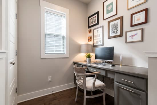
You can never go wrong with white. Victorian design often featured white accents and furniture to break up the heavy colors.
If you’re feeling bold, incorporate metallic accents, such as gold, brass, or copper, to add a touch of glamour and shine to the room.
Finally, don’t forget about patterns. Victorian design often featured rich floral designs and intricate patterns that incorporated many colors. Adding a patterned wallpaper, rug, or decorative element can add interest and texture to any space, while also tying in the traditional Victorian color palette.
By using lighter hues strategically, you can create a space that embodies the rich, luxurious feel of Victorian style without getting overwhelmed by the drama of the darker colors.
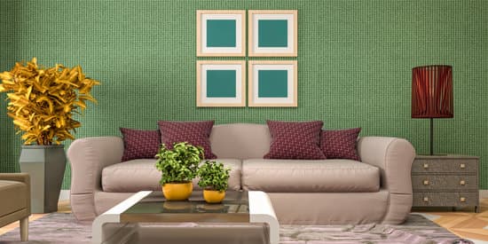
Victorian era is an epitome of elegance and grandeur, and the color palette often used during that time equally reflects this theme. The Victorian color palette comprised of a range of dark hues, including rich maroon, burgundy, deep reds, chestnut, brown, dark green, and blues. These colors are still relevant today and can add a touch of sophistication to any interior space. However, it is crucial to balance the use of these colors with lighter hues to avoid making a space look too overwhelming.
What Colors Evoke Victorian Era Elegance?