The Impact of Color on Mood
Have you ever walked into a room and instantly felt uplifted or relaxed? The colors of a room can have a great impact on our mood and emotions. Whether you want to create a space that energizes you for work or one that helps you unwind after a long day, choosing the right color can make all the difference.Warm Colors vs. Cool Colors: Which is Best?
When it comes to room color, there are generally two categories to choose from: warm colors and cool colors. Warm colors, like red, orange, and yellow, can evoke feelings of warmth, stability, and optimism. On the other hand, cool colors, such as blue, green, and purple, can promote feelings of calmness, relaxation, and tranquility. Interestingly, the best color for a particular space isn’t always predetermined by whether the room needs a warm or cool color. Rather, it’s about selecting the shade that brings you the most comfort and joy.Exploring the Psychological Effects of Red, Orange, and Yellow Hues
Let’s start with warm colors. Physiologically, these hues can increase our heart rate and blood pressure, which is why they are often referred to as energizing colors. However, the psychological effects of these colors can differ depending on the specific shade. Red: An intense, bold color that can evoke strong emotions like passion, love, and excitement. Too much red, however, can also lead to feelings of anger or irritation. Orange: A warm and inviting color that can promote enthusiasm and encouragement. Some may find brighter shades overwhelming, so consider a softer coral or pumpkin instead. Yellow: Cheerful and energizing, yellow hues can evoke feelings of optimism and happiness. However, a bright, intense shade can be too stimulating for some and may cause feelings of anxiety or irritation.Blue, Green, and Purple: The Soothing Effects of Cool Colors
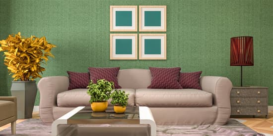
Unlike their warm counterparts, cool colors are known for their calming and relaxing effects. They are believed to lower blood pressure and heart rate, which can promote a sense of peace and tranquility. Blue: A calming color that often evokes feelings of serenity and security. Lighter shades, like baby blue or sky blue, can promote relaxation, while darker shades like navy bring a more sophisticated feel. Green: A symbol of nature and growth, green hues can promote feelings of balance and harmony. It’s also associated with Refreshment and symbolizes fresh beginnings. Purple: A color often associated with royalty, purple hues can promote feelings of luxury and creativity. Deeper shades can be quite calming, while brighter shades may be too stimulating.How Color Choice Affects Energy Levels
It’s important to consider the intended use of a space when choosing room color. For example, a home office may benefit from a warm, energizing color like red or orange, which can help boost productivity. Alternatively, a bedroom or relaxation space may be better suited for calming colors like blue or green. Here are a few more tips:- Consider adding accents of contrasting colors to add balance and interest to a space.
- Don’t be afraid to mix warm and cool colors to create a dynamic color palette.
- Keep in mind that lighting can also affect the way colors appear in a space. Test colors in different lighting situations to choose the best option.