What are Scandinavian Colors? The Ultimate Guide to Nordic Hues.

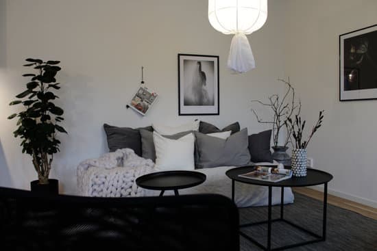
Scandinavian colors are a distinct set of colors that are commonly used in interior design to create a minimalist and elegant look. These colors are inspired by the natural elements found in the Scandinavian landscape, such as the deep blue of the sea, the gray of the sky, the white of the snow and the cream color of timber. The most commonly used colors for Scandinavian furniture are blue, gray, black, white, and cream. These colors have become synonymous with Scandinavian design and are now an official trademark. Here are some reasons why these colors are so adaptable:
  • Blue: The deep blue color symbolizes the sea and the sky, which are both important elements of Scandinavian natural environment. It creates a serene and tranquil atmosphere that is perfect for relaxation.
  • Gray: The gray color represents the stormy clouds and rocky cliffs found in the Scandinavian landscape. It has a calming effect and provides a neutral backdrop that allows other colors to stand out.
  • Black: Black is used to create a strong contrast and adds definition to Scandinavian designs. It is also used to evoke a sense of elegance and sophistication.
  • White: White is a staple color in Scandinavian design, symbolizing snow and ice. It creates a bright and airy atmosphere, making small spaces feel larger and more open.
  • Cream: Cream color represents the natural timber used in Scandinavian design, such as pine, oak, and birch. It adds warmth and texture to a space, creating a cozy and inviting atmosphere. In conclusion, Scandinavian colors are a perfect choice for anyone looking to create a minimalist and sophisticated look in their home. These colors are inspired by the natural elements of the Scandinavian landscape and have become a trademark of Scandinavian design. By using these colors in your home, you can create a serene and tranquil atmosphere that is both beautiful and functional.
    Interesting Read  How do Norwegians create cozy and minimalist homes?

    The Origins of Scandinavian Colors

    Scandinavian colors are rooted in the Nordic climate. The long, dark winters of Northern Europe create an environment that’s rich in grayscale tones and muted blues. These colors slowly made their way into Scandinavian decor and design, redefining the way we see color in interior design. The palettes that are associated with Scandinavian design are a reflection of the natural beauty of the region. Initially, Scandinavian interiors focused on protecting homes from the harsh elements of the northern climate. The use of light, airy tones such as white and cream worked perfectly for brightening up a dark interior and creating more space. Scandinavian colors were also used in a practical sense for their ability to reflect natural light into a room, necessary for such dimly-lit spaces.

    A Closer Look at the Most Commonly Used Colors

    The most commonly used colors in Scandinavian furniture are blue, gray, white, black, and cream. These hues are commonly used in tandem to create a cohesive aesthetic that is calming and neutral. – Blue: This color is typically found in the form of dark navy. It offers depth and mystery, adding a sense of warmth and comfort to any space. – Gray: This staple tone is a perfect match for Scandinavian design. It’s cool, calming, and blends perfectly with wood finishes while adding depth to any interior. – White: As previously mentioned, this tone is used heavily as it brightens up a room, but it also hints at the stark, snow-covered landscapes of Nordic regions. – Black: The contrast black provides is a great way to anchor any room or piece of furniture. From matte black finishes to wrought iron accents, black is a common choice for maintaining a minimalist aesthetic. – Cream: This color breaks up the grayscale of blue, gray, black, and white, providing a little contrast. It’s a versatile tone that can be paired with any of the previously mentioned colors.
    Interesting Read  What is Chic Decorating Style? Tips & Ideas for Your Home

    Significance of the Trademark Colors in Scandinavian Design

    The use of trademark colors pulls together the design and aesthetic of Scandinavian decor. The colors are the perfect complement to the simple, minimalist furniture that is associated with the style, further highlighting how these trademarks have become synonymous with the design. The Scandinavian color scheme is an ideal choice when creating a cohesive aesthetic across an entire home. The pared-down nature of the colors makes them easy to mix and match, allowing for effortless continuity from room to room. The colors chosen are also a reflection of the Nordic mentality. Known for their practical lifestyles, the colors represent a practicality that can’t be found in the bolder, brighter tones typically associated with other styles of decor.

    Achieving a Minimalist Aesthetic with Scandinavian Colors

    Minimalism is one of the main tenets of Scandinavian design, and the colors used strongly reflect this. Achieving a minimalist aesthetic can be done by utilizing the trademark colors and incorporating streamlined, simple furniture. When planning out a minimalist space, carefully consider the function of each room in the house. In order to maximize the space and keep it tidy, every item in the room should serve a purpose and have its own specific place. It’s important to tie together the space with a consistent color palette. Scandinavian color schemes make this easy, and the ability to mix and match hues to create a personalized color scheme is something that this style excels at.

    How to Incorporate Scandinavian Colors into Your Home Decor

    While the trademark colors of Scandinavian design are not overly difficult to work with, implementing them can be a challenge for those who are not familiar with the style.
    Interesting Read  What is Typical Nordic Style? Discover the Secrets of Scandinavian Design
    – Blue: Incorporate blue into your space by opting for a navy throw pillow or a calming blue wall color. – Gray: Use gray as a base color for any room in your home by pairing it with white and cream accents. – White: Play up the brightness of white with light wood accents and pops of greenery. – Black: Iron accents and matte black furniture pieces punctuates any room. – Cream: Use cream as a color pop against darker gray, blue or black accents in a room. The combination of hues allows anyone to create a space that is both stylish and functional, without compromising on the decorative details.

    Creating Contrast and Cohesion with Scandinavian Color Palettes

    Scandinavian colors are all about hinting at the natural elements of the region. They play up the color of asphalt and granite, the shifting hues of the sky, the mystique of a dark forest. When dealing with various hues and shades as found in a Scandinavian color scheme, it is important to create contrast within a room to make sure that it does not end up feeling dull or lifeless. A great way to achieve this is by introducing different textures and patterns within a space. Incorporating natural textures such as wood and stone, or contrasting patterns like chevrons and stripes, will add depth to the space and create visual interest throughout. The cohesive palette of Scandinavian colors allows for creative and bold design choices that can be tailored to any space. In conclusion, the simplicity and practicality of Scandinavian color palettes transcend design trends and allow for easy incorporation into any interior space. The Nordic-inspired trademarks of blue, gray, white, black, and cream offer a way to focus on what is essential in creating a welcoming and comfortable home.

  • Total
    0
    Shares
    Previous Article

    How to Create a Functional 10x10 Home Office: Practical Tips and Design Ideas

    Next Article

    Why Florida's Mobile Home Obsession Keeps Growing

    Related Posts