What is the 70 20 10 rule in interior design? Make your space pop with this simple trick.

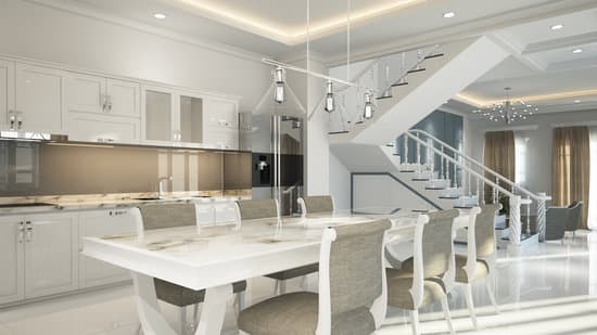
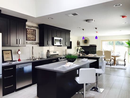
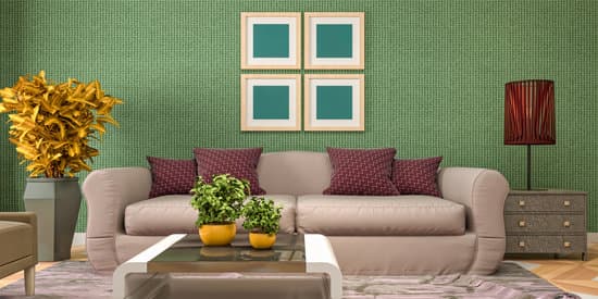
The 70-20-10 rule in interior design is a principle that can help you create a cohesive and balanced look in your space. Essentially, this rule means dividing your color scheme into three distinct parts:
  • 70 percent of your components, such as your walls and flooring, should be in one primary color.
  • 20 percent of your components, such as fabrics like curtains, upholstery, and rugs, should be a secondary color that complements the primary color.
  • 10 percent of your components should be in an accent color that adds pops of interest to the space. This could include decor items like throw pillows, vases, or artwork.
  • By following the 70-20-10 rule, you can create a balanced and visually appealing space that has just the right amount of variety and interest without appearing too chaotic or overwhelming.
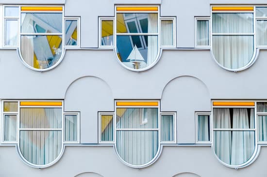
    The basics of the 70-20-10 rule

    The 70-20-10 rule is a popular formula used in the field of interior design to achieve a balanced and harmonious look in a space. According to this rule, a well-designed room should be composed of three different colors: a primary color that makes up 70% of the space, a secondary color that represents 20%, and an accent color that makes up the remaining 10%. This proportion helps to maintain a cohesive and coordinated look within a room while allowing for some creative design choices.

    How to choose your primary color for the 70 percent

    When choosing your primary color for the 70%, consider the overall mood you want to create in the room. Warm tones like beige, cream, and brown can create a cozy and inviting atmosphere, while cooler colors like blues and greens can promote a sense of calm and relaxation. Neutral colors like white and gray are versatile and can work with any style or color scheme. It’s also essential to take into account how much natural light the space receives and whether you’re working with existing elements like furniture or artwork.
    Interesting Read  What is the most durable flooring for your home?

    Tips for selecting the secondary color for the 20 percent

    Your secondary color should complement your primary color while providing a visual contrast. This color can be found in fabrics such as curtains, upholstery, and rugs, or in smaller decor pieces like throw pillows or artwork. Consider colors on the opposite side of the color wheel for a bold look, or choose shades of the same color for a more subtle effect. Don’t be afraid to experiment with pattern and texture, as long as they complement and enhance the overall look of your space.

    Creative ideas for incorporating the accent color

    The accent color is where you can let your creativity shine. This color can be incorporated through smaller decor pieces like candles, picture frames, and vases. Consider adding accent pillows in a bold pattern or color, or choosing a unique piece of artwork or a statement light fixture. The accent color should add interest and depth to your space without overwhelming the overall design.

    Examples of successful interior designs using the 70-20-10 rule

    One example of a successful design using the 70-20-10 rule is a living room with beige walls (primary color), blue curtains and throw pillows (secondary color), and metallic gold accents (accent color). Another example is a bedroom with gray walls (primary color), pink bedding and curtains (secondary color), and gold lamps and artwork (accent color). Both designs demonstrate how the 70-20-10 rule can create a cohesive and stylish look.

    How to modify the percentages to suit your personal style

    While the 70-20-10 rule is a helpful guideline, don’t be afraid to modify the percentages to suit your personal style. For example, you may prefer a more monochromatic look with 90% of one color and 10% of another, or you may choose to use multiple accent colors for a more eclectic look. The most important thing is to ensure that your color choices complement each other and create a cohesive design.
    Interesting Read  Revamp Your Space: Updating Outdated Paneling Made Easy.

    Common mistakes to avoid when using the 70-20-10 rule in interior design

    One common mistake is not considering the existing elements in a space when choosing colors. It’s important to take into account any fixed elements like flooring or furniture and choose colors that complement and enhance these elements. Another mistake is not considering the lighting in a space. Different lighting can affect how colors appear, so it’s important to test your color choices in different lighting situations before making a final decision. Lastly, it’s important not to be too rigid in following the 70-20-10 rule. Use it as a guideline but don’t be afraid to make adjustments to suit your personal style and taste. Using the 70-20-10 rule is a tried-and-true method for creating a visually pleasing and cohesive interior design. By following these guidelines and experimenting with color and texture, you can create a space that is both stylish and functional. Remember to consider your personal style and taste and to have fun with the design process.

    Total
    0
    Shares
    Previous Article

    How to decorate in Art Deco style on a budget?

    Next Article

    Uncovering the Colorful Story Behind Victorian Houses' Nickname

    Related Posts