Determining a Color Scheme with the 60-30-10 Rule:
As a homeowner or designer, choosing a color scheme for a room can be a daunting task. You want to ensure that the colors you choose harmonize and complement one another, creating a cohesive and stylish look. The 60-30-10 rule can help you achieve this.Understanding the Basics of the 60-30-10 Rule
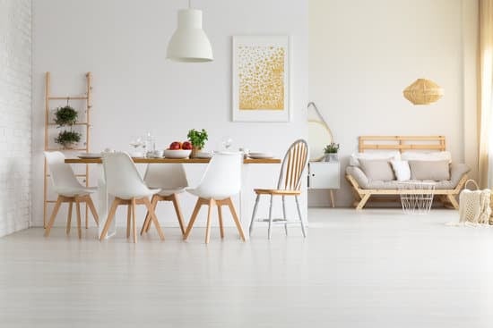
The 60-30-10 rule is a simple, yet effective design principle that can help you achieve a balanced and visually pleasing color scheme. The rule suggests that you choose three colors for a space: a dominant color, a secondary color or texture, and an accent color. The dominant color should make up 60% of the room, the secondary color or texture should make up 30% of the space, and the remaining 10% should be reserved for accents.Choosing a Dominant Color for the Room
When choosing a dominant color, it’s important to consider what mood or feeling you want to convey in the space. Do you want the room to feel calm and serene? If so, consider a cool, neutral color such as blue or gray. If you want the space to feel energetic and lively, a brighter color such as red or yellow may work better. Key Point: Choose a dominant color that you love and that will set the tone for the rest of the room.Incorporating a Secondary Color or Texture
The secondary color or texture is an opportunity to add depth and interest to the space. Think about what color or texture will complement the dominant color. For example, if you have chosen a blue dominant color, a complementary secondary color could be a soft gray or a warm beige. Alternatively, you could add texture with a patterned wallpaper or a shag rug. Key Point: The secondary color or texture should add depth and interest to the room without overpowering the dominant color.Utilizing Accents in the Right Way
Accents are the finishing touches that bring a room together. They can be in the form of throw pillows, artwork, or decorative accessories. When choosing accents, think about what will add interest and balance to the space. Use accents sparingly, as too many can detract from the overall design. Key Point: Accents should be used to bring balance and interest to the room, while not overwhelming the overall design.How to Deviate from the 60-30-10 Rule
While the 60-30-10 rule is a helpful guideline, it’s important to remember that rules are meant to be broken. Depending on the space and your personal style, you may choose to deviate from this rule. For example, you may want to use a monochromatic color scheme, with varying shades of the same color, or you may want to use a complementary color scheme, with colors that are opposite each other on the color wheel. Key Point: While the 60-30-10 rule is a helpful guide, feel free to deviate from it to create a customized color scheme that reflects your personal style.Examples of Successful Color Schemes Using the 60-30-10 Rule
Here are a few examples of successful color schemes using the 60-30-10 rule:- A navy blue dominant color, paired with a beige secondary color, and accents of metallic gold
- A soft gray dominant color, paired with a white secondary color, and accents of deep plum
- A warm beige dominant color, paired with a soft blue secondary color, and accents of bright yellow


