What is a Warm Color and How to Use it in Your Home Decor?

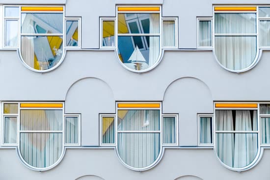
A warm color is a tone on the color wheel that creates a feeling of warmth and energy in a space. Warm colors consist of shades of red, yellow, and orange, as well as any combination of these three hues. These colors are perfect for brightening up any room, creating a cozy atmosphere, and infusing positive energy. On the other hand, cool colors like blue, green, and purple evoke calm and relaxation and are perfect for creating a serene atmosphere. It is important to note that neutral colors like gray and white can also be warm or cool depending upon their undertones. Here are some instances where warm colors are ideal:
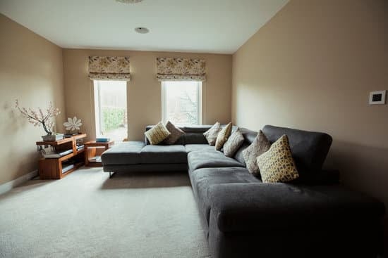
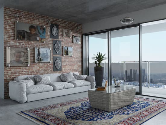
  • Living rooms: Warm colors create a comfortable and inviting atmosphere in a living room, making it perfect for social gatherings and activities.
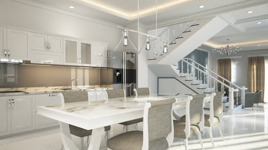
  • Kitchens: A splash of warm color can make a kitchen feel more welcoming and energetic, making it an excellent choice for a busy space where people gather.
  • Bedrooms: Warm colors can create a cozy and comforting environment in a bedroom, making it the perfect place to relax and unwind after a long day.
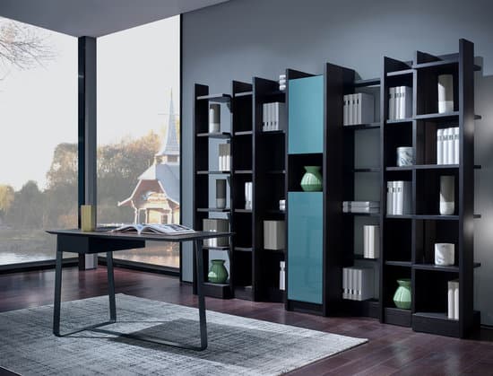
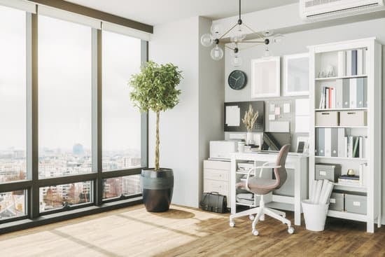
  • Offices: Warm colors can foster creativity and productivity in an office space, making them an excellent choice for a workspace.
  • Overall, the use of warm colors in a space can have an immense impact on how people feel in that space. They’re perfect for creating a vibrant and welcoming environment in any room while infusing positivity and energy.
    Interesting Read  What Colors Transform Your Home into a Modern Haven?

    The Psychology of Warm Colors

    Warm colors like orange, yellow, and red are often associated with energy, enthusiasm, and excitement. They can create a sense of warmth in a room, and make it feel more inviting and cozy. Unsurprisingly, warm colors are often used in living spaces like living rooms and dining rooms, where people tend to gather and socialize. One of the reasons warm colors are so effective at creating a welcoming atmosphere is because they can stimulate the brain to release more dopamine. This chemical is associated with feelings of pleasure and reward, and can make people feel happier and more positive overall. Warm colors also tend to be associated with feelings of confidence, which can make them a popular choice in spaces like home offices and classrooms.

    A Closer Look at Orange, Yellow, and Red

    While all warm colors can have similar effects on mood, each color also has its own unique associations and meanings. Orange, for example, is often associated with creativity and playfulness. It can also help to stimulate conversation and social interactions, making it a good choice for spaces like kitchens and dining rooms. Yellow is often associated with the sun, and can create a sense of optimism and positivity. It is a popular choice for bedrooms, as it can promote feelings of relaxation and calmness. It can also be used in studies and home offices, where it can encourage mental clarity and focus. Red is perhaps the most intense of all warm colors, and is often associated with passion and energy. It is a popular choice for romantic spaces like bedrooms and dining rooms, but can also be used in more energetic spaces like home gyms and game rooms. Key point: Each warm color has its own unique associations and meanings, and can be used to create different moods and atmospheres within a space.

    Blending Warm Colors for Harmonious Design

    One of the challenges in working with warm colors is finding ways to balance them within a space. Using too much of any one warm color can feel overwhelming, while using too many warm colors together can create a sense of chaos and confusion.
    Interesting Read  What Color Choices Bring Positive Vibes to Your Home?
    One effective strategy is to use warm colors alongside neutral colors like beige, gray, or white. This can help to balance out the intensity of the warm colors, while also creating a sense of visual harmony. Another option is to use warm colors in small doses, such as in accent pillows or artwork, to add pops of color without overwhelming the space. Key point: Balancing warm colors within a space is key to creating a cohesive and harmonious design.

    Warm Colors: How to Add Energy to Any Room

    If you’re looking to add some energy and positivity to a room, warm colors are a great place to start. Consider adding some accent pieces like throw pillows or curtains in a warm color to create a sense of warmth and coziness. You could also try painting one wall in a warm color to create a focal point within the room. When working with warm colors, pay attention to how they interact with the lighting in the room. Natural light can enhance warm colors and make them feel more vibrant, while artificial light can sometimes make them feel more muted. Experiment with lighting to find the right balance for your space. Key point: Warm colors can add a sense of energy and positivity to any room, and can be used in a variety of ways to achieve this effect.

    Exploring the Benefits of Cool vs Warm Colors

    While warm colors are great for creating a sense of warmth and positivity, cool colors like blue and green have their own unique benefits. Cool colors are often associated with feelings of calmness and relaxation, and can be used to create a sense of tranquility within a space. Cool colors can also be beneficial in rooms where you want to promote mental clarity and focus. For example, green is often associated with balance and harmony, and can be a good choice for a study or home office. Blue, on the other hand, is often associated with productivity and efficiency, making it a good choice for a home gym or workspace.
    Interesting Read  What color never goes out of style? The timeless answer
    Key point: Cool colors can be used to create a sense of calmness and relaxation in a space, and can be beneficial in rooms where mental clarity and focus are important.

    Understanding the Subtones of Neutral Colors

    Neutral colors like gray and white can be warm or cool depending upon their undertones. For example, a gray with blue undertones will feel cooler and more calming, while a gray with yellow undertones will feel warmer and more inviting. Understanding the subtleties of neutral colors can be helpful in creating a cohesive color scheme within a space. Consider using a color wheel or paint swatches to help identify the undertones of different neutral colors. Key point: The undertones of neutral colors can have a significant impact on the overall mood and atmosphere of a space, and should be considered when creating a color scheme. In conclusion, warm colors are a powerful tool for creating a sense of energy and positivity within a space. By understanding the unique associations and meanings of different warm colors, and by balancing them with neutral colors or using them in small doses, you can create a cohesive and harmonious design. Remember to consider the lighting in the room, and to experiment with different colors to find the right balance for your space.

    Total
    0
    Shares
    Previous Article

    What is Cabincore Aesthetic? Exploring Rustic Charm & Cozy Living

    Next Article

    How Much Does Home Insurance Cost in the US?

    Related Posts