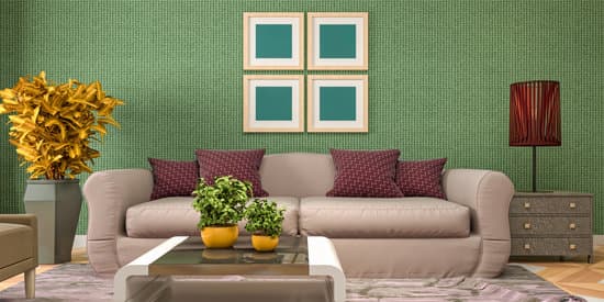
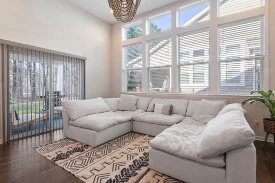
When it comes to decorating, color is key. There are three color types that are commonly used in the creative process, including primary, secondary, and tertiary colors. Here’s a breakdown of each:
By understanding the different types of colors and how they are created, you can create beautiful, cohesive designs that are both eye-catching and pleasing to the senses. Whether you’re looking to create a bold statement or a more subtle color palette, considering the different color types and how they work together is key.
Color Theory 101: Primary, Secondary, and Tertiary Colors
Color is a crucial component of home decorating, and understanding the basics of color theory is essential to achieving the desired look and feel. Color theory is a set of principles used to create a cohesive color scheme. It involves understanding the three color categories: primary, secondary, and tertiary.
Primary colors are the building blocks of all other colors and are not created by mixing any other colors. The primary colors are yellow, red, and blue. When combined in equal amounts, these three colors create a neutral color like black, gray, or white.
Secondary colors are created by mixing two primary colors. The secondary colors are green (yellow and blue), orange (red and yellow), and violet (red and blue).
Tertiary colors are a combination of one primary color and one secondary color. They are created by mixing adjacent primary and secondary colors on the color wheel. The six tertiary colors include yellow-green, blue-green, red-orange, yellow-orange, blue-violet, and red-violet.
The Power of Primary Colors in Home Decorating
Primary colors are crucial in home decorating as they are strong, bold and eye-catching. Each primary color evokes a different emotion – red is passionate, yellow is cheerful, and blue is calming. Adding a pop of primary color in a room can create an accent that draws the eye.
When using primary colors, it’s essential to balance them with neutrals and other hues to avoid overwhelming the space. A simple way to do this is by incorporating primary color accent pieces such as art, throw pillows, or a rug.
Blending Techniques: How to Mix Primary Colors to Create Secondary Colors
Knowing how to mix primary colors to create secondary colors is an important skill for home decorators. This technique allows for a broader range of colors to be utilized in the design process, creating a harmonious color scheme.
When mixing primary colors, it’s essential to use equal parts of each color to create an even blend. For example, mixing equal parts of red and blue creates a perfect violet hue. Using a color wheel as a visual guide can help identify which primary colors will combine to create the desired hue.
Tip: To create lighter hues, add white to the mix. To create darker hues, add a touch of black.
A Playful Palette: Combining Secondary Colors to Add Personality to Your Home
Secondary colors are playful and add personality to a space. Combining two secondary colors creates an exciting and dynamic color scheme. For example, green and orange create an energetic color combination, while violet and orange create a more dramatic effect.
When using secondary colors, it’s essential to ensure a balance with neutrals to keep the space from becoming too busy. A neutral background allows secondary colors to add visual interest and pop.
Tip: To add depth to the color scheme, incorporate tertiary colors.
Tertiary Colors: The Secret to Achieving Unique and Sophisticated Decor
Tertiary colors can add depth, dimension, and sophistication to any space. As a blend of primary and secondary colors, they offer a unique color palette. Using tertiary colors in home decorating helps create a cohesive color scheme that feels intentional and well-designed.
When using tertiary colors, it’s important to pick colors that are adjacent to each other on the color wheel for a harmonious look. For example, yellow-orange accents paired with a red-orange statement piece add dimension without overwhelming the space.
Tip: When using tertiary colors, be mindful of where they are placed in the room and avoid overuse.
Discover the Color Wheel and How to Use it in Decorating
The color wheel is a visual representation of the relationships between primary, secondary, and tertiary colors. It helps decorators identify which colors work well together to create a cohesive color scheme.
Using the color wheel, decorators can choose analogous colors (colors next to each other on the wheel) for a harmonious scheme, complementary colors (colors opposite each other on the wheel) for a high contrast scheme, or a monochromatic scheme using different shades of the same color.
Tip: When in doubt, use the 60-30-10 color rule – 60% of a dominant color, 30% of a secondary color, and 10% of an accent color.
In conclusion, understanding color theory and the three categories of colors (primary, secondary, and tertiary) is integral to achieving a well-designed and cohesive color scheme. The use of bright and bold primary colors can create eye-catching accents, while the blending of primary colors can create a brighter color scheme. Combining secondary colors can add personality to a space, and the use of tertiary colors can add depth and sophistication. So, go ahead, discover the power of color and transform your home into a vibrant and inviting space.