What are Postmodern Colors?
The postmodern color palette has taken the design world by storm. It is characterized by a mix of retro and natural hues, along with metallic shades that give it a bold yet sophisticated feel. These colors convey a sense of nostalgia, paired with a modern twist, making them the perfect choice for those seeking an eclectic look. They are versatile and can be incorporated into a variety of design schemes, from home décor to fashion. Here are some of the postmodern colors that are trending right now.Retro Hues: The Comeback of Mustard and Avocado Green
Retro hues like mustard and avocado green have made a comeback in recent years. These colors were popular in the 60s and 70s, but they have been given a fresh twist for a postmodern look. Mustard is a muted yellow hue that adds warmth and depth to any room. It pairs well with neutrals like grey and beige, and can also be combined with brighter colors like teal and navy blue. Avocado green is a rich, earthy tone that works well with natural materials like wood and leather. It is perfect for creating a warm and inviting space, especially in the kitchen or living room. Key Point: Retro hues like mustard and avocado green are making a comeback in postmodern color schemes.Natural Hues: Embracing the Beauty of Burnt Orange and Turquoise
Natural hues like burnt orange and turquoise are also popular in postmodern color schemes. Burnt orange is a deep, rusty tone that adds warmth and drama to a space. It pairs well with earthy neutrals like brown and green, as well as metallic gold and copper accents. Turquoise is a bright and bold color that adds a pop of color to any room. It works well with other natural hues like brown and beige, and also pairs well with metallic silver and brass accents.Some examples of natural hues in postmodern color schemes include:
- Burnt orange
- Turquoise
- Olive green
- Deep purple
- Earthy browns
The Boldness of Metallic Shades in Postmodern Color Schemes
In addition to retro and natural hues, postmodern color schemes also include metallic shades like gold, silver, and copper. These colors add a touch of luxury and sophistication to any space. They can be used to highlight architectural features like molding and trim, or to add accents to furniture and accessories. Metallic shades also pair well with other colors in the postmodern palette, like retro hues and natural hues.Some examples of metallic shades in postmodern color schemes include:
- Gold
- Silver
- Copper
- Bronze
- Brass
Finding Balance in Postmodern Color Palettes
One of the challenges of using postmodern colors is finding the right balance. The key is to use them in moderation, and to pair them with neutral shades like white, beige, and grey. This helps to tone down the boldness of the colors, and to create a cohesive look. It is also important to consider the amount of natural light in the room, as this can affect how the colors appear. Key Point: Finding the right balance is essential in creating a cohesive postmodern color scheme.Mixing and Matching Retro and Natural Hues for a Postmodern Look
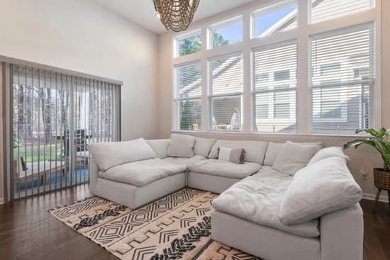
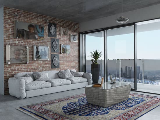
Another way to incorporate postmodern colors into your home décor is to mix and match retro and natural hues. This creates an eclectic look that is both stylish and sophisticated. For example, you could pair a mustard yellow sofa with a burnt orange accent wall, or a turquoise rug with an avocado green armchair. The possibilities are endless, and the key is to experiment and have fun with the colors.How to Incorporate Postmodern Colors into Your Home and Garden Décor
There are many ways to incorporate postmodern colors into your home and garden décor. Here are some ideas to get you started: Incorporating Postmodern Colors into Your Home:- Use retro hues like mustard and avocado green in your living room or kitchen
- Pair natural hues like burnt orange and turquoise with metallic accents like gold and silver
- Mix and match different postmodern colors to create an eclectic look
- Use neutral shades like white, beige, and grey to balance out the boldness of the colors
- Choose plants with colorful foliage, like succulents and ornamental grasses
- Use colorful garden furniture and accessories, like brightly colored chairs and planters
- Plant a variety of colorful flowers, like zinnias, marigolds, and sunflowers
- Use colorful garden art, like metal sculptures and painted pots, to add a postmodern touch