The Evolution of Modern Color Choices
Color choices have come a long way since the days of cave drawings and ancient frescoes. From the opulent hues favored by Renaissance painters to the bold, psychedelic shades of the 1960s and beyond, color trends have always mirrored the cultural and social mindset of the time. Today’s modern color choices continue to evolve as we embrace new technologies and push the boundaries of design.Embracing Minimalism with Neutral Hues
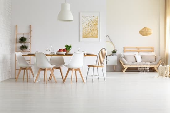
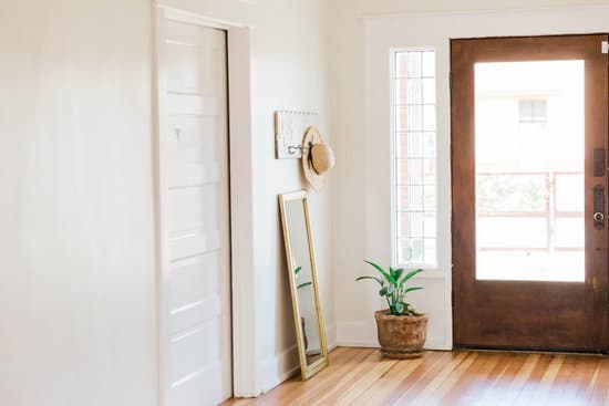
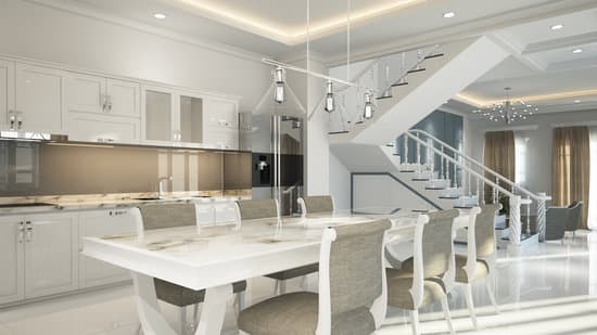
One of the defining traits of modern design is its emphasis on clean lines and minimalism. This aesthetic can be achieved through the use of neutral hues. Whites, beiges, grays, and other muted tones create a sense of calm and order in a space. They allow the eye to focus on the shapes and textures of the furnishings and decor rather than being distracted by bold colors. When used effectively, neutral hues can also make a space feel more open and spacious. Key point: Neutral hues are perfect for creating a minimalist aesthetic, but be careful not to overdo it. Too much white or beige can make a space feel cold and sterile.Making a Statement with a Pop of Color
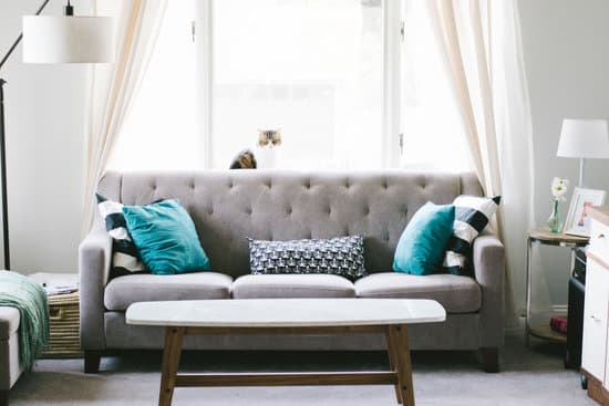
While neutral hues are popular in modern design, this doesn’t mean that color has no place. In fact, a well-placed pop of color can make a big statement in a space. Whether it’s a bold red accent wall or a colorful piece of artwork, using color strategically can add interest and personality to a room. In modern design, pops of color are often used sparingly, so they really stand out. Key point: When using pops of color in a modern space, choose one or two hues and use them consistently throughout the room. This creates a cohesive, intentional look.Understanding the Psychology Behind Color Choices
Color choices can also have a psychological impact on a space. For example, blue is often associated with calmness and tranquility, making it a popular choice for bedrooms and bathrooms. Green is often associated with nature and growth, which makes it a good choice for spaces that are meant to inspire creativity and productivity. Red, on the other hand, can create a sense of excitement and energy, making it a good choice for spaces meant for socializing and entertaining. Key point: When choosing colors for a space, consider the emotions and moods that you want to evoke. Use colors that promote the desired feelings.Playing with Complementary Colors in Modern Design
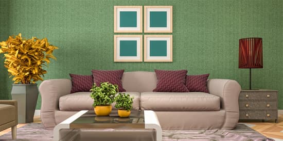
Another way to add interest to a modern space is by playing with complementary colors. Complementary colors are opposite each other on the color wheel, and when used together, they create a sense of vibrancy and energy. For example, blue and orange are complementary colors, as are yellow and purple. When used in a modern space, complementary colors can create a dynamic and visually engaging effect.- Use complementary colors sparingly to avoid overwhelming a space
- Choose one complementary color pair and use it consistently throughout the room
- Consider using complementary colors in unexpected ways, such as in a piece of furniture or a light fixture