Interesting Read What is the modern color for 2023? A sneak peek into the future of interior design.
How to Coordinate Colors in Your Home: The 60-30-10 Rule Demystified
As a homeowner, you want your living space to be visually appealing and comfortable. One of the most crucial aspects of your home’s aesthetic appeal is its color scheme. Coordinating colors in your house can be tricky, particularly if you are unfamiliar with color theory. Thankfully, the 60-30-10 rule is a simple guideline that can help you coordinate the colors of your home like a pro. In this article, we will discuss the 60-30-10 rule and how to incorporate it into your home’s design.Understanding the 60-30-10 rule for color coordination
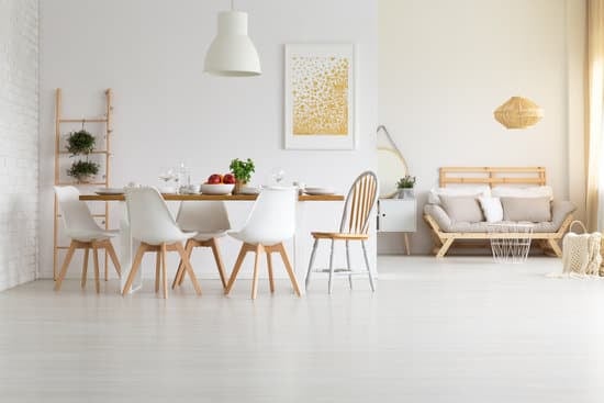
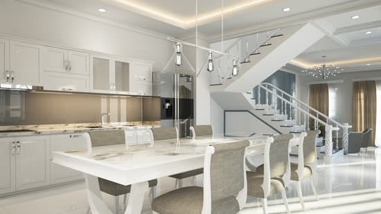
The 60-30-10 rule is a timeless guideline for decorating a room with color. The concept of this rule is simple: 60 percent of your room’s color should come from your primary color, 30 percent from your secondary color, and 10 percent from your accent color. Think of the primary color as the foundation of your color palette, the secondary color as a complement, and the accent color as the pop of color that ties everything together. This rule can be applied to everything from wall colors and furniture to decor and accessories.Choosing a primary color for your space
Your primary color sets the tone and foundation of your home’s color scheme. This color will take up 60 percent of your room’s color. When choosing a primary color, consider the mood you want to create and the style of the room. Warm colors such as reds, yellows, and oranges are stimulating and energizing, while cool colors such as blues, greens, and purples, are calming and relaxing. Neutral colors such as beige, gray, and white, are versatile and can be used as a great foundation for any color scheme. Pro tip: If you are hesitant about using bold colors on your walls, try using them in your furniture or as accent pieces.Selecting a secondary color to complement your design
After selecting a primary color, select a secondary color that complements it. This color will account for 30 percent of the room’s color. Your secondary color should also match the style and mood of your room. Consider using shades that are lighter or darker than your primary color to add depth to your room’s color scheme. Check out these matching color schemes for inspiration:- Blue and green
- Yellow and purple
- Red and orange
- Gray and pink
- Beige and brown
Accent colors: Adding pops of color to your room
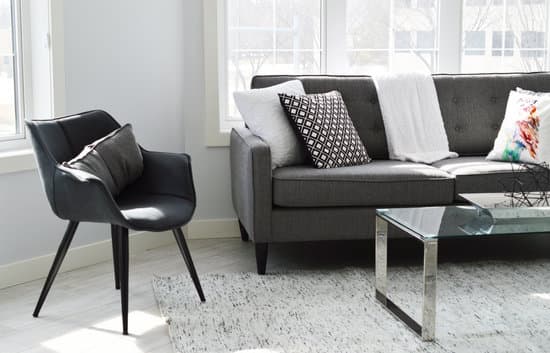
Accent colors are the finishing touches that add pops of color to your room. They account for 10 percent of the overall color scheme. These can be bright colors that add life and excitement to your room. Consider using artwork, throw pillows, curtains, or other accents to add a pop of color. You can also highlight architectural elements in the room such as window frames, chair rails, and baseboards by painting them in an accent color. Pro tip: Use no more than three accent colors – too many can create a cluttered or chaotic look.Blending colors seamlessly: Tips and tricks
Blending colors seamlessly is essential for creating a cohesive look in your decor. Here are some tips and tricks to keep in mind when creating your color scheme:- Start with the largest item in the room, such as a sofa or rug, and build your color scheme around it.
- Use complementary colors on opposite sides of the color wheel for a harmonious look.
- Incorporate texture and patterns in your decor as a way to add interest without adding additional colors.
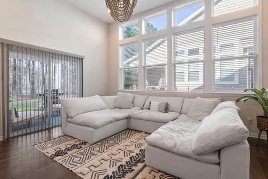
- Consider using a monochromatic color scheme where different shades of one color are used throughout the room.
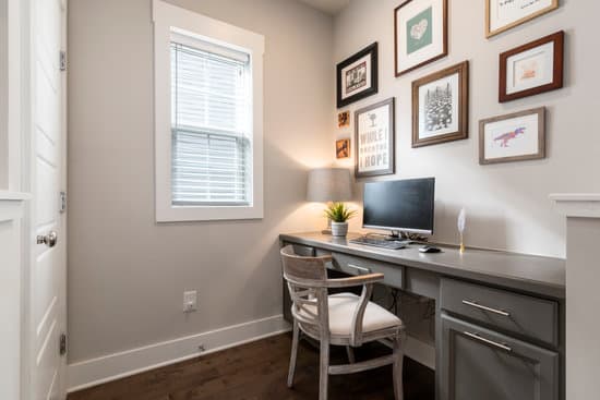
Incorporating color coordination beyond paint and furniture
Color coordination extends beyond paint and furniture. Here are some tips to incorporate color into other design elements:- Use colored towels and bath mats in your bathroom.
- Invest in colorful dishes, glassware, and linens for your kitchen.
- Paint your front door a bright color to add curb appeal to your home.
- Choose colorful bedding, pillows, and throws for your bedroom.
- Add potted plants or flowers for a natural burst of color.