The Origins of Retro Colors
Retro colors are a throwback to a time when the world was a very different place. The term retro itself is a shortened form of the word retrospective, which means something that looks back on or refers to a past time. In the case of colors, retro shades reminisce on color trends that were popular from the 1920s to the 1980s. These colors have an iconic presence, carrying with them a sense of nostalgia and familiarity that can evoke memories of childhood or even a personal sense of history.Understanding Color Trends from the 1920s to the 1980s
Over the decades, colors have been influenced by various factors such as socio-economic changes, cultural movements, technological advancements, and even political events. For example, the 1920s saw the rise of Art Deco, a design style characterized by geometric shapes, bold colors, and metallic finishes. Colors were used to reflect this opulence, with gold and silver being popular choices. In the 1950s, color palettes became more pastel and feminine due to the rise of the baby boomers and the return of soldiers from war. This trend continued through to the 1960s, with the introduction of psychedelia and the use of bold colors like bright turquoise and hot pink. The 1970s saw a move away from bright colors and instead, muted earth tones became popular. This was due to the environmental movement and a return to nature. The 1980s saw a return to brighter colors and a pop culture influence, with neon and primary colors becoming popular.Warm vs. Cool: Retro Color Palettes
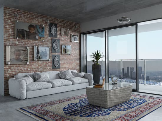
Retro colors can be divided into two distinct palettes – warm and cool. Warm colors are those that are brighter and have a warmer tone such as oranges, yellows, and pinks. These were popular in the 1960s and 70s. Cool colors, on the other hand, are those that are more subdued and peaceful like blues, greens, and greys. These were popular in the 1920s and 30s. When combined, warm and cool colors create a harmonious retro color scheme that can be used in many home decor settings.Muted Tones: A Signature of Retro Colors
Muted tones are colors that are less bright and vibrant. Instead, they are toned down and more subdued. This is a signature feature of many retro color palettes. Muted colors create a calming and relaxed atmosphere, making them ideal for intimate settings like bedrooms or living spaces. Some popular muted retro tones include olive green, burnt orange, and mustard yellow. These colors work well together in a more subdued palette and can be accented with small pops of brighter colors for added interest.Popular Retro Color Schemes
The great thing about retro colors is that they can be combined in a variety of ways to create unique and striking color schemes. Some popular retro color schemes include:- Art Deco – gold, black, pale pink, and turquoise
- Midcentury – avocado green, mustard yellow, and brown
- Pop art – bright pink, red, yellow, and blue
- 70s – bronze, rust, avocado, ochre, and orange
Tips for Incorporating Retro Colors in Your Home Décor
If you want to incorporate retro colors into your home decor, here are some tips to keep in mind:- Start small – incorporating retro colors into your decor can be overwhelming if you don’t start small. Begin by adding small accessories or accents such as pillows or curtains.
- Stick to a palette – when using retro colors, it’s important to stick to a specific color palette. This will help create a cohesive look and feel.
- Use neutral colors – neutral colors like white, grey, and beige can help balance out bold and bright retro colors.