Understanding the concept of the Rule of Thirds
The Rule of Thirds is a popular design principle used in various fields, including graphic design and photography. It works by dividing a canvas, image, or layout into thirds, both vertically and horizontally, to create a grid-like structure. These individual sections act as guidelines to determine the placement of the key elements in the design and find the balance between negative and positive space. This design principle encourages the designer to break away from a centralized or symmetrical layout and create a more dynamic and visually interesting composition. By using the Rule of Thirds, you can create a sense of flow and movement that guides the viewer’s eyes to the focal point of the design.How the Rule of Thirds works in photographic composition
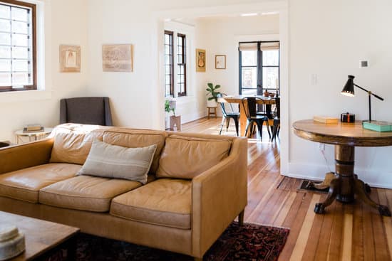
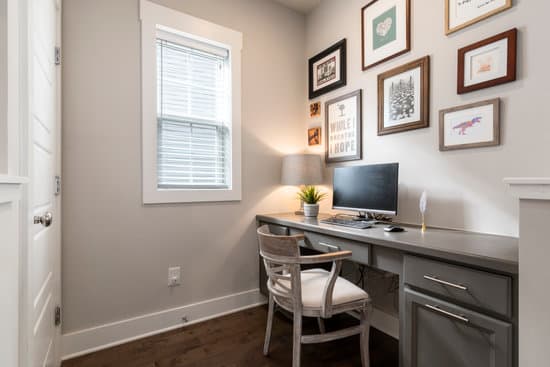
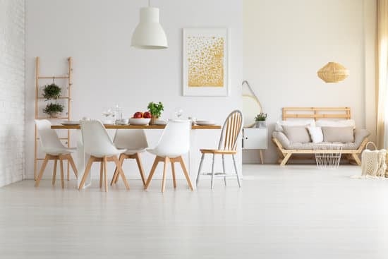
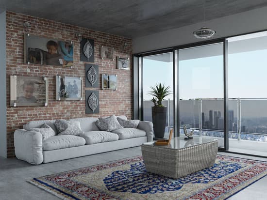
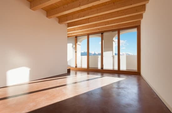
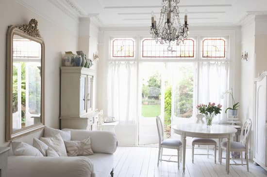
The Rule of Thirds is particularly useful in photographic composition. It allows you to create a more visually appealing image that draws the viewer’s attention to the main subject while keeping the composition balanced. By placing the subject in one of the intersection points of the grid lines, you can create a more dynamic and engaging photograph. The Rule of Thirds also helps to create visual depth and perspective in photographs. By placing objects at different points on the grid lines, you can create a sense of foreground, middle ground, and background. This technique enables you to create a more immersive and engaging image that captures the viewer’s attention.Applying the Rule of Thirds to website design
The Rule of Thirds is equally applicable in website design. By using this principle, you can create a balanced and visually engaging layout that guides the user’s eyes to the most important elements on the page. The Rule of Thirds can be applied in website design by dividing the screen into thirds and placing the key elements in one of the intersections of the grid lines. Using strong design principles such as the Rule of Thirds can help to enhance the user experience and improve the overall functionality of the website. It can also make the website more aesthetically pleasing and memorable.The correlation between the Rule of Thirds and visual balance
Visual balance is a crucial aspect of any design. The Rule of Thirds is just one of the many design principles that contribute to creating visual balance. By dividing the canvas into thirds, this design principle allows you to create an equal balance between negative and positive space in the layout. The Rule of Thirds helps to create visual balance by placing the key elements of the design in one of the intersections of the grid lines. This technique guides the viewer’s eyes to the most important elements, creating a sense of harmony and balance in the design.Exploring the flexibility of the Rule of Thirds in design
While the Rule of Thirds is a useful design principle, it is just one of the many techniques available to designers. It is essential to understand that not every design will benefit from using the Rule of Thirds. Depending on the project’s goals, you may need to use other design principles to create the desired effect. However, the Rule of Thirds is a flexible design principle that can be applied to various design projects, from website layouts to photographic compositions. It is an excellent starting point for designers looking to create a balanced and engaging design.Breaking down the steps to utilize the Rule of Thirds successfully
To utilize the Rule of Thirds successfully, follow these steps:- Step 1: Divide the canvas or layout into thirds, both horizontally and vertically
- Step 2: Identify the key elements of the design
- Step 3: Place the key elements in one of the intersections of the grid lines
- Step 4: Create a balance between negative and positive space in the design
- Step 5: Review the design and make any necessary adjustments to achieve the desired effect.
The benefits of using the Rule of Thirds in graphic design
There are numerous benefits to using the Rule of Thirds in graphic design. Some of these benefits include:- Creating visually interesting compositions: By breaking away from centralized or symmetrical layouts, you can create a dynamic and engaging design that captures the viewer’s attention
- Enhancing visual balance: The Rule of Thirds helps to create a balance between negative and positive space, creating a more harmonious design
- Improving usability: By placing the key elements in one of the intersections of the grid lines, you can guide the user’s eyes to the most important parts of the design, enhancing the overall usability
- Creating a sense of flow: The Rule of Thirds helps to create a sense of flow and movement in the design, guiding the viewer’s eyes from one section of the design to another