Understanding the Rule of Three Colors
The rule of three colors is a popular principle in home decor and graphic design. The principle suggests that a palette of three colors, consisting of a primary hue and two complimentary colors, creates an aesthetically pleasing and balanced look. The primary hue is the dominant color while the complimentary colors add depth and interest to the palette.How to Choose the Primary Hue for Your Palette
Choosing the right primary hue for your palette is crucial to the success of the rule of three colors. The primary hue should be a color that you love and that speaks to the overall mood and vibe you want to create. Some popular primary hues include variations of red, blue, green, and yellow. Tip: Use a color wheel to determine which primary hue to choose. Look for colors that are opposite each other on the wheel as they create the most contrast and visual interest.Discovering Complimentary Colors for Your Palette
Once you have chosen your primary hue, it’s time to think about complementary colors. Complimentary colors are colors that are opposite each other on the color wheel. They create a beautiful contrast when used together and bring out the best in each other. Tip: Use a color palette generator to help you choose your complimentary colors. These tools can analyze your primary hue and suggest the best complimentary colors to use.Examples of the Rule of Three Colors in Home Decor
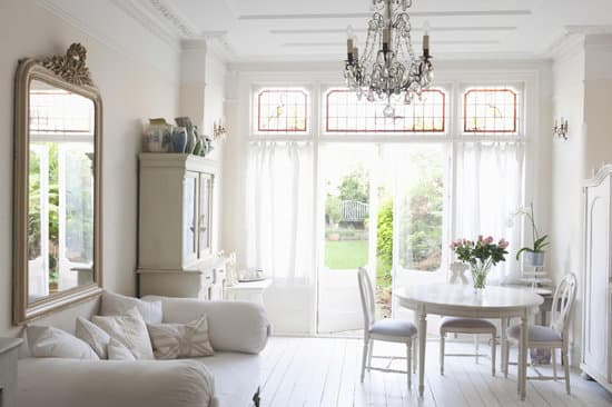
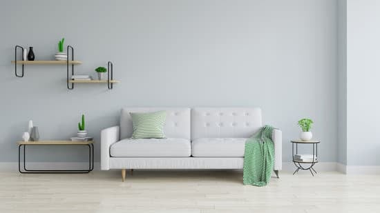
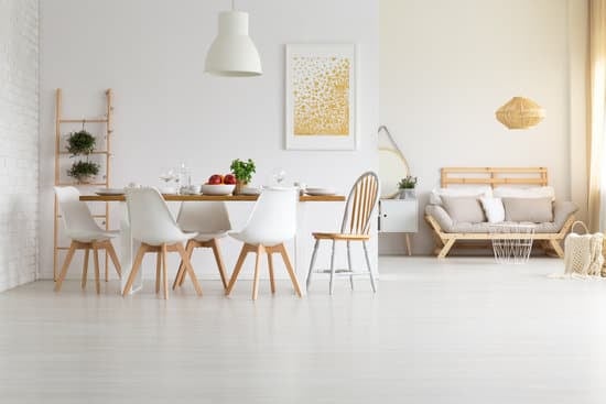
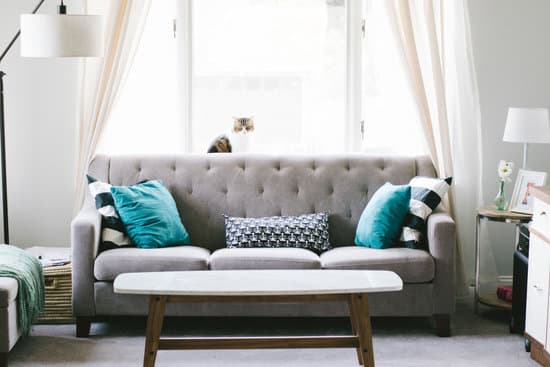
The rule of three colors can be seen in various home decor styles, from modern to traditional. For example, in a modern living room, a primary hue of white could be complemented with a navy blue and a mustard yellow. In a traditional kitchen, a primary hue of beige could be complemented with a forest green and a rust red. Tip: Look for inspiration on social media and home decor blogs to see how others have used the rule of three colors in their homes.Playing with Tones and Shades in Your Palette
Another way to add depth and interest to your rule of three colors palette is by playing with tones and shades. Tones are created by adding grey to a color, while shades are created by adding black. By using different tones and shades of your primary hue and complimentary colors, you can create a more nuanced and layered look. Tip: Use color swatches or paint samples to experiment with different tones and shades before committing to your final color palette.Tips for Creating a Balanced Palette with the Rule of Three Colors
To create a balanced rule of three colors palette, consider the following tips:- Use your primary hue in the majority of the space or room
- Use one of your complimentary colors in a smaller amount throughout the space or room
- Use the second complimentary color as an accent color in the form of accessories or artwork
- Aim for a 60-30-10 ratio: 60% of your primary hue, 30% of your first complimentary color, and 10% of your second complimentary color