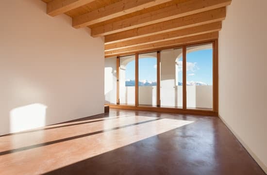
The 60-30-10 rule is a fantastic way to create a color scheme for your home. This design rule has been used by professionals for years and is an excellent tool for beginners to use when decorating their space. Here’s a breakdown of the 60-30-10 rule:
60% Dominant Color: This is the color that sets the tone of the room. It usually covers the largest area, like the walls or floor. Pick a color you love and feel comfortable with to ensure you’re happy with your space’s overall mood.
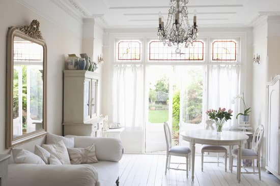
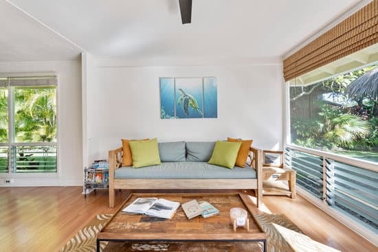
30% Secondary Color or Texture: This color or texture should complement the dominant color of the room. You can use it on furniture and accessories like rugs, curtains, or decorative pillows. Opting for a complementary design will help keep the décor cohesive and add depth to space.
10% Accent Color: The accent color is where you can have some fun and be bold. This color typically comes in the form of accessories like picture frames, lamps, flowers and cushions. It adds a pop of color and personal flair to space. Don’t be afraid to add some pizzazz and showcase your personality!
Using the 60-30-10 rule from the start is a sure way to create a balanced and cohesive room that will make you feel right at home. By following the rule, you can create a space that feels aesthetically pleasing, well thought out and put together.
What is the 60 30 10 rule for room color coordination?