What is the 3 Color Rule in Interior Design? Here’s Everything You Need to Know!

The 3 color rule in interior design is one of the fundamental principles that interior designers or home decor enthusiasts follow in creating a beautiful and harmonious living space. This rule involves dividing the colors used in a room into three categories. Let’s look at each category in more detail:
  • Dominant Colors (60%) – This refers to the primary colors that make up the largest proportion of the space. It can be the color of the walls, floor, or main furniture pieces. The dominant color should create a cohesive and consistent backdrop, setting the tone for the rest of the colors in the room.
  • Secondary Colors or Texture (30%) – This category adds depth and interest to space and includes the complementary colors to the dominant color. Secondary colors can be in the form of accent walls, area rugs, or decorative pillows. Texture, on the other hand, includes materials such as wooden floors, exposed bricks, or stone walls that can add visual interest to space.
  • Accents (10%) – Accents are the final touch that brings the room together. There should be a pop of color or texture to add interest and life to the space. Accents can be in the form of throw pillows, wall art, or decorative items on shelves and coffee tables. It’s important to note that accents should complement, not overpower, the dominant and secondary colors in the room.
  • By following the 3 color rule, you can create a cohesive and visually pleasing living space. Remember to keep the balance between the colors, and don’t be afraid to play with different shades and textures to keep the space interesting.
    Interesting Read  What color house exudes luxury and elegance?

    Understanding the Color Rule in Interior Design

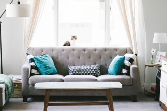
    Color can make or break an interior design project. Choosing the right colors can create a sense of balance, harmony, and unity, while the wrong colors can make a space feel chaotic and overwhelming. One of the fundamental principles of color theory in interior design is the 3 color rule, also known as the 60-30-10 rule. This rule states that 60 percent of the space should be in a dominant color, 30 percent in a secondary color or texture, and the remaining 10 percent should be used as an accent. Understanding how to use this rule can help you create a visually appealing space that feels cohesive and put-together.

    The Importance of Dominant Colors

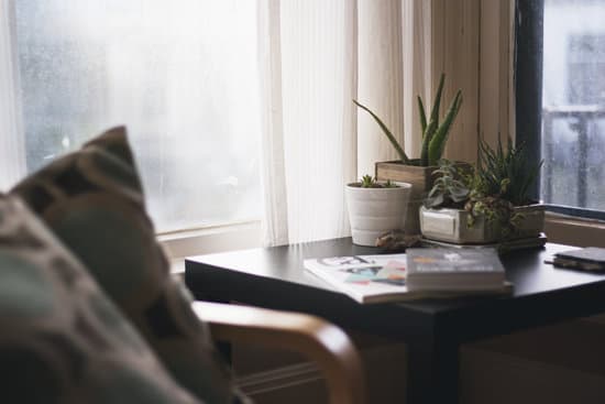
    Dominant colors represent the primary hue used in a space and are responsible for creating the overall mood and feel of a room. When selecting a dominant color, it is essential to consider the overall style and function of the space. For example, if you want to create a soothing and relaxing bedroom environment, you might want to choose a calming shade of blue or green as your dominant color. It is best to stick to one dominant color and play around with various shades and tones to create depth and interest within the space. Tip: To create a cohesive color palette, choose colors that complement each other on the color wheel. Colors that sit opposite each other are considered complementary and work well together.

    Secondary Colors and Textures

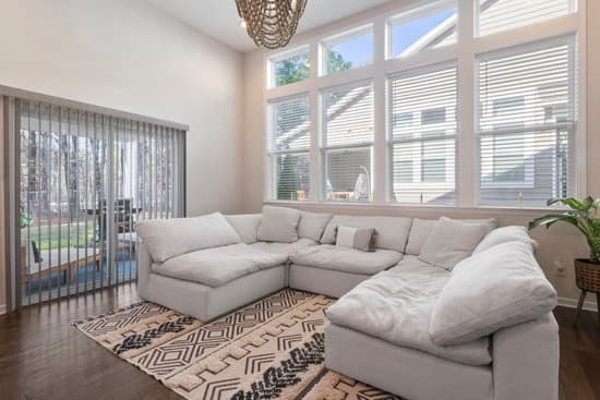
    Secondary colors and textures are responsible for adding depth and interest to a space. These can be used in the form of throw pillows, area rugs, curtains, and artwork. When selecting secondary colors and textures, it is best to choose hues that complement the dominant color but also add visual interest and balance. For example, if your dominant color is a light shade of blue, you might want to incorporate a secondary color like a deep navy blue or earthy green. Textures like velvet, linen, and wool can also add interest and depth to a room.
    Interesting Read  What is one of the most common wall finishes in a home? Discover the answer and get inspired!
    Tip: Use patterned textiles to add a touch of fun and playfulness to a space. Mix and match prints and textures for a visually appealing and eclectic look.

    Accent Colors: Making a Splash

    Accent colors are the finishing touches of a space and are designed to make a bold statement. These can be used sparingly and should not overpower the dominant or secondary colors in the space. Accent colors can be used in the form of decorative pillows, throw blankets, vases, and other decorative objects. When selecting accent colors, it is best to choose hues that complement the dominant and secondary colors. In addition, accent colors should add contrast to the space and create visual interest. Tip: Use metallic accents like gold, silver, and copper to add a touch of glamour and sophistication to a space.

    Exploring Different Color Combinations

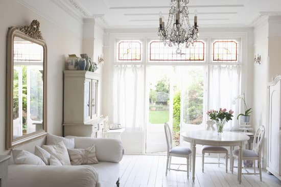
    Color combinations can greatly affect the mood and feel of a space. While some color combinations are timeless and classic, others may feel trendy and short-lived. Some popular color combinations include:
    • Blue and white: creates a serene and calming atmosphere
    • Gray and yellow: adds a playful and cheerful element to a space
    • Black and white: creates a classic and timeless look
    • Green and beige: adds a touch of nature and tranquility to a room

    Tips for Choosing and Implementing Colors in Your Home

    1. Consider the overall mood and feel of the space you want to create. 2. Choose a dominant color that complements the room’s style and function. 3. Play around with different shades and tones of the dominant color to create depth and interest. 4. Use secondary colors and textures to add depth and interest. 5. Incorporate accent colors sparingly to create a bold statement. 6. Mix and match patterns and textures to create a visually appealing and eclectic space. 7. Don’t be afraid to experiment with different color combinations.
    Interesting Read  What should a meditation room look like? 10 Inspiring Ideas

    Mistakes to Avoid When Applying the Color Rule in Interior Design

    1. Overusing accent colors: Accent colors should be used sparingly and should not overpower the dominant or secondary colors in the space. 2. Choosing colors based solely on trends: It is essential to choose colors that complement the overall style and function of the space rather than solely basing colors on current trends. 3. Ignoring the color temperature: Color temperature refers to the warmth or coolness of a color. It is important to ensure that the colors in a space have a cohesive color temperature. 4. Choosing too many colors: Too many colors can create a chaotic and overwhelming space. Stick to three colors or less to create a cohesive and visually appealing space. 5. Not considering natural light: Natural light can greatly affect the mood and feel of a space. Consider the amount and direction of natural light when selecting colors for your space. In summary, the 3 color rule in interior design is a fundamental principle of color theory that can greatly affect the mood and feel of a space. Understanding how to use this rule can help you create a visually appealing space that feels cohesive and put-together. Remember to choose colors that complement the overall style and function of the space, play around with shades and tones, and use accent colors sparingly. Avoid common mistakes such as overusing accent colors and choosing colors based solely on trends. With these tips, you can create a space that looks and feels like it was professionally designed.

    Total
    0
    Shares
    Previous Article

    What is Considered Contemporary Now? Exploring Modern Home Design.

    Next Article

    What is Baroque in interior design? Discover its luxurious style.

    Related Posts