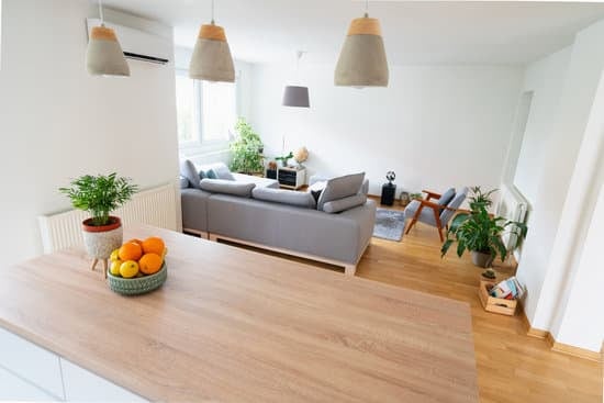
Vintage color palettes: a brief overview
As we look back at the various eras of fashion and design, the colors that were considered in at the time are a crucial part of the story. From pastel shades of the 1920s to the bold and bright hues of the 1980s, each decade had its own distinct palette. Vintage colors, therefore, can refer to any color scheme that was popular in the past. However, some specific color combinations stand out as quintessentially vintage. In this article, we’ll explore some of the most noteworthy vintage color palettes, including sunshine, TV-inspired hues, nightcap shades, California dreaming, and Shaka.The warmth and nostalgia of sunshine hues
When we think of sunshine-inspired colors, we think of bright and bold yellows, oranges, and pinks. These hues evoke a sense of warmth, happiness, and nostalgia for the carefree days of the past. These colors were popular throughout the mid-century modern period, from the 1950s through the 1970s. The sunny hues often complemented the clean lines and simple geometric shapes of mid-century furniture and decor. Today, these vibrant shades can add a pop of color and a sense of retro charm to any space. Some of the key shades in a sunshine-inspired color palette include:- Bright yellow – associated with optimism, joy, and energy
- Tangerine orange – evokes a sense of playfulness and creativity
- Bubblegum pink – conveys a youthful, lighthearted spirit
- Sky blue – brings a sense of calm and tranquility to a space
Adding a pop of retro with the TV-inspired color schemes
As television became a fixture in American households in the 1950s and 60s, it had a marked influence on interior design. TV-inspired color palettes often featured bold shades of turquoise, pink, and chartreuse, alongside more subdued neutrals like gray and cream. These colors created a sense of excitement and modernity in spaces and often paired well with retro furniture designs like Eames chairs and kidney-shaped coffee tables. Some standout colors from a TV-inspired palette include:- Turquoise – a bold and vibrant shade that brings a sense of sophistication to a space
- Chartreuse – a bright and playful hue that can add interest and dimension to any room
- Hot pink – a bold and daring color that evokes glamour and a sense of fun
- Gray – a cool and sophisticated neutral that balances out the bright pops of color
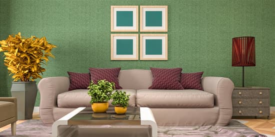
The moody and sultry shades of a nightcap-themed palette
For a more sophisticated and sultry vintage color scheme, look no further than the nightcap palette. Inspired by the colors of sunset and the dark hues of night, this palette features deep purples, blues, and grays, along with warm oranges and reds. These moody shades are perfect for creating a cozy and intimate atmosphere in any room, whether it’s a living room or bedroom. Some key colors to consider in a nightcap-themed palette include:- Deep purple – a rich and luxurious shade that evokes a sense of royalty
- Charcoal gray – a dark and moody neutral that pairs well with any other color
- Warm orange – a fiery hue that brings a sense of energy and passion to a space
- Burgundy – a deep, wine-inspired color that adds depth and richness to a palette
Exploring the colorful world of California dreaming
From the beaches to the mountains, California has always been a trendsetter in fashion and design. The California dreaming color palette captures the vibrant and eclectic nature of the Golden State, with bright and bold hues inspired by the natural landscape and the laidback lifestyle of its inhabitants. This palette often features a combination of warm and cool colors, with sunny yellows and oranges alongside deep shades of green and blue. Some key colors to consider in a California dreaming palette include:- Golden yellow – a sunny color that brings a sense of warmth and energy to a space
- Seafoam green – a calming and soothing shade that evokes the natural beauty of the ocean
- Fuchsia – a bold and playful hue that adds a sense of drama and excitement to any room
- Mint green – a fresh and invigorating color that pairs well with other cool tones
Channeling the laidback vibes with Shaka-inspired colors
For something a bit more relaxed and low-key, consider a Shaka-inspired color palette. Named after the popular hand gesture synonymous with surf culture, this palette features cool and calming shades of blue, green, and gray, along with warm earth tones like sand and brown. These colors evoke a sense of peacefulness and harmony, perfect for creating a serene and welcoming space. Some key colors to consider in a Shaka-inspired palette include:- Sky blue – a calming and refreshing shade that brings a sense of peace to a room
- Ocean blue – a deeper shade that evokes the majesty of the sea and the calming effects of nature
- Sand – a warm and earthy tone that adds a sense of warmth and texture to a space
- Olive green – a quietly powerful color that evokes a sense of serenity and balance