Interesting Read What is Classic French Interior Design? Tips and Ideas to Achieve the Look at Home.
The Meaning Behind Wabi-Sabi Style Colors
Wabi-Sabi is a traditional Japanese design philosophy that embraces imperfection and simplicity. It is centered on the belief that beauty can be found in the natural world and that objects with a history of use can be not only beautiful, but also inspiring. Wabi-Sabi style colors are chosen to embody these values and create an atmosphere that is both unpretentious and welcoming.Embracing the Splendors of Nature: Colors in Wabi-Sabi
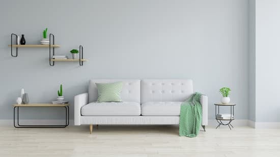
Wabi-Sabi style is all about bringing the beauty of nature into your home. By creating a color palette that reflects the world beyond our walls, we can embrace the simple pleasures of life and find peace in our surroundings. When choosing colors for a Wabi-Sabi style room, consider natural elements such as rocks, plants, and sky. Allow the colors to blend and harmonize, creating a sense of tranquility and balance.Peaceful and Soothing Tones for Your Wabi-Sabi Palette
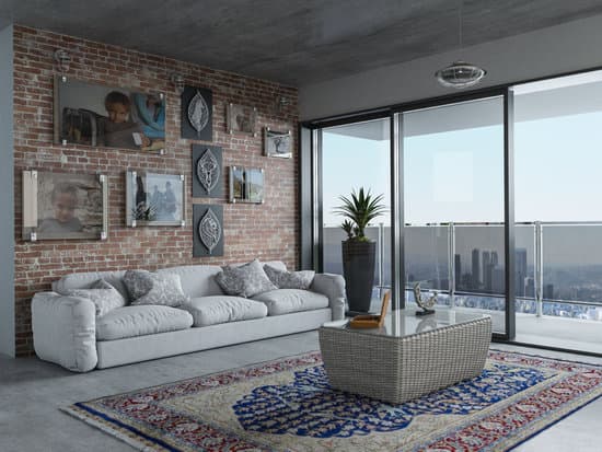
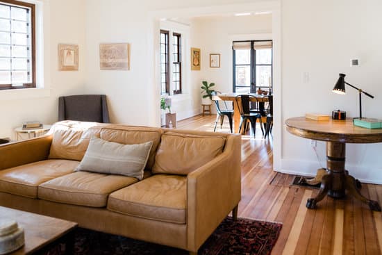
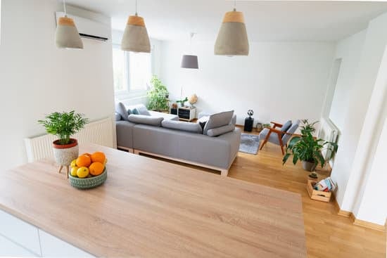
The Wabi-Sabi color palette is intended to create a sense of tranquility and peace in your home. To achieve this, choose earthy and muted colors that inspire calmness and relaxation. Soft grays, muted blues, and muted greens all lend themselves well to this design style, creating a peaceful and serene atmosphere.Enhancing Your Home with Earthy Beiges and Browns
Earthy beiges and browns are a cornerstone of the Wabi-Sabi color palette. These colors remind us of the earth and its many forms, from rocks and stones to soil and sand. Use these colors to create a grounding influence in your home, bringing a sense of stability and substance to your interior design. Some earthy beiges and browns to explore include:- Sandstone
- Tan
- Sienna
- Umber
- Caramel
Soft Greens: An Essential Color in Wabi-Sabi Design
Soft greens are another essential hue in the Wabi-Sabi color palette. Think of the colors of moss, forest, and leaves – muted and understated, yet rich with life and vitality. Green hues lend a sense of renewal and growth to a space, reminding us of the never-ending cycle of life. Some soft greens to consider include:- Olive
- Moss
- Sage
- Mint
- Seafoam
Dark Tones in Wabi-Sabi: The Perfect Balance of Light and Shadow
While Wabi-Sabi style is primarily built around muted and earthy tones, dark tones can also play an important role in creating a sense of balance and contrast. Darker tones lend richness and depth to a space, helping to create a sense of intimacy and warmth. Some dark tones to consider include:- Charcoal
- Deep brown
- Dark green
- Navy blue
- Black