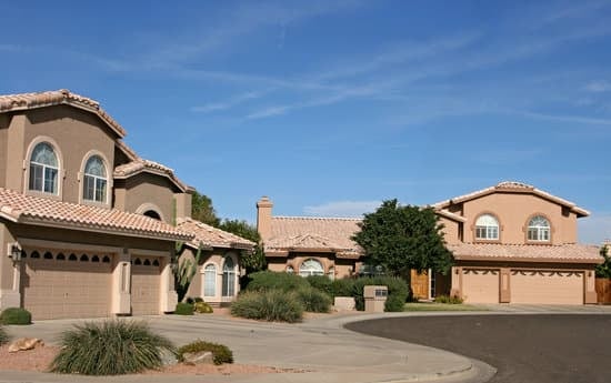
- Muted neutrals – think creams, beige, and yellowed browns
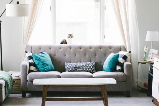
- Teal – a classic retro accent color
- Blues – especially in muted or pastel shades
- Peach and light pink – art deco style pastels that are making a comeback
- Sage – a soft green that adds some retro charm
Introduction to Retro Colors
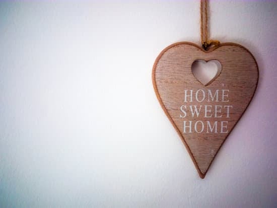
Retro colors are not a new thing. In fact, they have made a comeback in recent years thanks to the popularity of vintage styles. They are often muted shades that give off a sense of nostalgia and charm. These colors can be seen in everything from clothing to home decor, and even in garden designs. What sets retro colors apart from other color schemes is their association with the past and the memories they evoke.Muted Hues: The Charm of Retro Colors
One thing that immediately stands out about retro colors is their muted hues. These shades are not as bold as primary colors, but instead, they bring a subtle elegance to any design. Retro colors tend to have an earthy quality to them, with shades like burnt orange, mustard yellow, and olive green being popular choices. These colors have a way of making a statement without being too overwhelming, making them perfect for anyone looking to add a touch of sophistication to their designs. Key Point: Retro colors are all about subtlety and charm, bringing elements of the past to the present in a meaningful way.Beyond Primary Colors: The Retro Palette
Unlike primary colors, which are bright and vibrant, retro colors are a bit more complex. They often include variations of browns, blues, greens, and grays. These colors are all about the subtleties, with shades ranging from milky pastels to deeper jewel tones. These colors are perfect for anyone looking to add a sense of warmth and comfort into their space, making it feel inviting and cozy.Exploring Neutrals in Retro Colors
One of the defining features of retro colors is the use of neutrals like creams and yellowed browns. These shades bring a sense of age to any design, making it feel as if it has been around for decades. They also pair incredibly well with other retro colors like teal and burnt orange, providing a sense of balance and harmony to any design. Key Point: Retro colors often include neutrals like creams and yellowed browns, giving a sense of age and richness to designs.Art Deco Pastels: A Retro Classic
Pastels were incredibly popular during the Art Deco era, and they remain a classic choice for anyone looking to incorporate retro colors into their designs. These shades are often light and airy, with peach and light pink being popular choices. They provide a playful and whimsical element to any design, while still maintaining a sense of sophistication.Inspired by the Decades: Color Influences in Retro Design
Retro colors span across several decades, each with its own distinct color influences. For example, the 1920s were all about pastels and art deco styles, while the 1960s were more vibrant, with shades of orange and yellow dominating. By understanding the color influences of each decade, you can create a retro color scheme that is truly authentic and reflective of the era.Retro Color Schemes for Your Home
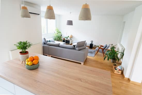
Incorporating retro colors into your home is a great way to add a sense of character and personality to your space. Some popular retro color schemes include:- Burnt orange, mustard yellow, and olive green
- Peach, light pink, and mint green
- Navy blue, maroon, and mustard yellow