What 3 colors look nice together? Tips from a design enthusiast.

When it comes to mixing and matching colors, there are endless possibilities and it can be tough to decide which ones will complement each other nicely. If you’re in need of some inspiration, here are three color palettes that look great together:
  • Red, yellow, and blue: This classic combination of primary colors creates a bold and vibrant look. You can play around with different shades and hues to achieve different effects. For example, a softer shade of blue paired with a bright red and sunny yellow can evoke a playful and cheerful vibe, while a deeper shade of blue with a richer red and golden yellow can create a more sophisticated and dramatic feel.
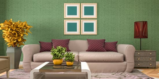
  • Orange, green, and purple: This trio of warm, cool, and neutral colors creates a striking and unexpected combination. Orange adds vibrancy and energy, green brings freshness and calmness, and purple adds depth and richness. This color scheme works well for both bold and subtle designs, depending on the intensity of the hues you choose.
  • Magenta, teal, and gold: This trendy and glamorous palette combines a bold pink shade with a cool blue-green and a warm metallic tone. It creates a look that is both playful and elegant, and works particularly well for modern and feminine designs. You can use magenta as the main color and add accents of teal and gold, or mix all three colors in equal parts for a cohesive and eye-catching look.
    Interesting Read  What Color Flowers Add Curb Appeal to Your House?

    Beautiful Triadic Color Combinations

    There are many different ways to combine colors in design and fashion. When it comes to color theory, one popular approach is the use of triadic color combinations. These are combinations that include three colors that are equally spaced from each other on the color wheel. The result is a visually appealing and harmonious look that can work well in many different settings. Here are three examples of beautiful triadic color combinations that you may want to consider using in your own designs.

    Red, Yellow, and Blue – A Classic Trio

    For a classic and timeless look, consider using a triadic color combination that includes red, yellow, and blue. These colors are primary colors and form the foundation of the color wheel. When they are combined, they create a vibrant and energetic look that can work well in many different settings. For example, you might use this color combination in a child’s room to create a playful and fun atmosphere, or in a modern living room to add a pop of color. Key point: Red, yellow, and blue are primary colors that form a classic and timeless triadic color combination that can work well in many different settings.

    Orange, Green, and Purple – Harmonious Shades

    Another great triadic color combination to consider is orange, green, and purple. These colors are all secondary colors that are created by mixing two primary colors together. When they are combined in a triadic color scheme, they create a look that is both harmonious and eye-catching. This color combination can work well in a variety of settings, from a bohemian-inspired living room to a nature-inspired wedding theme. Key point: Orange, green, and purple are secondary colors that create a harmonious and eye-catching triadic color combination.
    Interesting Read  What is a Mindfulness Room? Creating a Calm Space for Self-Care.

    Magenta, Teal, and Gold – A Luxurious Trio

    For a luxurious and sophisticated look, consider using a triadic color combination that includes magenta, teal, and gold. These colors are bold and vibrant and can add a touch of glamour to any setting. This color combination can work well in a variety of settings, from a formal dining room to a chic fashion accessory. Key point: Magenta, teal, and gold create a bold and luxurious triadic color combination that can add glamour and sophistication to any setting.

    Adding Depth and Interest with Triadic Colors

    One of the great things about triadic color combinations is that they can add depth and interest to any design. When used in moderation, these colors can bring together different elements and create a cohesive look. For example, you might use a triadic color scheme to add depth and interest to a monochromatic outfit, or to add visual interest and dimension to a garden or landscaping design. Key point: Triadic color combinations can add depth and interest to any design when used in moderation.

    How to Use Triadic Colors in Home Decor

    If you want to use a triadic color scheme in your home decor, there are a few things to keep in mind. First, choose one color to be dominant and use the other two colors as accents. This will help create a balanced look that is not too overwhelming. Second, be sure to vary the intensity of the colors to add depth and dimension to your space. For example, you might use a deep blue as your dominant color, with a bright yellow accent and a softer shade of red. Key point: When using a triadic color scheme in home decor, choose a dominant color and vary the intensity of the colors to create a balanced and visually appealing look.
    Interesting Read  What should a meditation room look like? 10 Inspiring Ideas

    Fashion Tips for Triadic Color Combinations

    When using a triadic color scheme in fashion, it’s important to keep your accessories and makeup simple. Let the colors speak for themselves and avoid adding too many distractions. You might also consider using one of the colors as your base color and then introducing the other two colors in smaller amounts. For example, you might wear a purple dress with gold earrings and teal shoes. Key point: When using a triadic color scheme in fashion, keep your accessories and makeup simple and consider using one of the colors as your base color.

    Using Triadic Colors in Landscaping and Garden Design

    If you want to use a triadic color scheme in your landscaping or garden design, be sure to consider the surrounding environment. Choose colors that will compliment the colors of your home or the natural landscape. You might also consider using one of the colors as your dominant color and then incorporating the other two colors in smaller amounts. For example, you might use purple flowers as your dominant color, with yellow and green accents. Key point: When using a triadic color scheme in landscaping and garden design, consider the surrounding environment and choose colors that will compliment the natural landscape.

  • Total
    0
    Shares
    Previous Article

    Is Geometric Design Art Deco? Exploring the Stylish Trend in Home Decor.

    Next Article

    What is the simplest house to build? Discover the easiest and cheapest options for your dream home.

    Related Posts